Splunkのグラフとコマンド(Splunk式)のサンプル集です。
バージョンはSplunk Enterprise 8.0.3を使用しています。
グラフのデータはCOVID-19コミュニティモビリティレポートを使用しています。
https://www.google.com/covid19/mobility/
また、コマンドはあくまでサンプルです。
「折れ線グラフでは必ずtimechartが必要」等の意味ではないのでご注意をば。
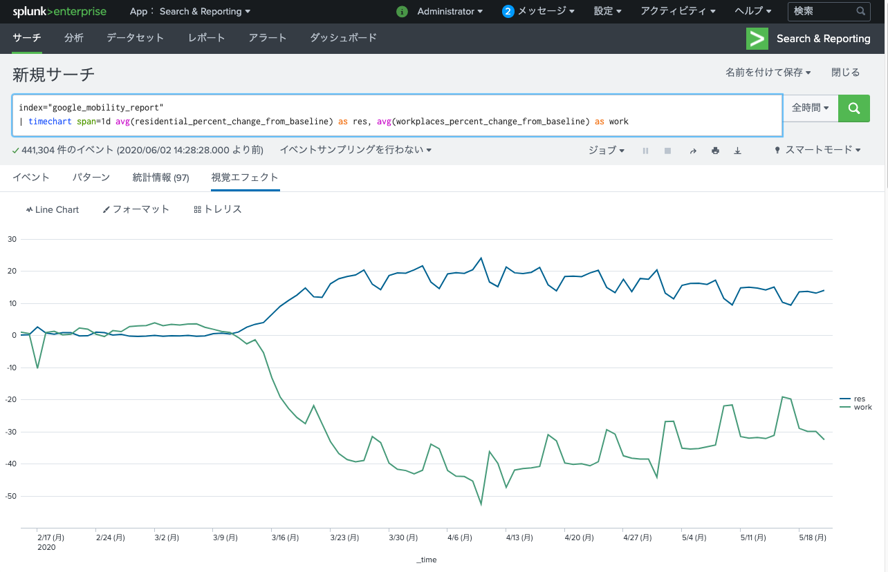
折れ線グラフ(Line Chart)
コマンド
index="google_mobility_report"
| timechart span=1d avg(residential_percent_change_from_baseline) as res, avg(workplaces_percent_change_from_baseline) as work
↑のコマンドは| timechart <値1> <値2>...の例ですが、別にstats等でもグラフ自体は作成可能です。
グラフ
面グラフ(Area Chart)
※コマンドは折れ線グラフと同じでOKです。視覚エフェクトで”Area Chart”を選択してください。

円グラフ(Pie Chart)
index="google_mobility_report"
| where country_region_code = "JP"
| stats avg(residential_percent_change_from_baseline) as res by sub_region_1
| stats <表示したい値> by <分類方法>
↑で円グラフの表示内容を決定します。
分類が細かすぎると下図のように頭が悪そうなグラフになってしまいます。
棒グラフ(Column and Bar Chart)
index="google_mobility_report"
| stats avg(residential_percent_change_from_baseline) as res, avg(workplaces_percent_change_from_baseline) as work by date_wday
※以下のグラフは両方↑のコマンドです。視覚エフェクトを変更しているだけです。
Column Chart
Bar Chart
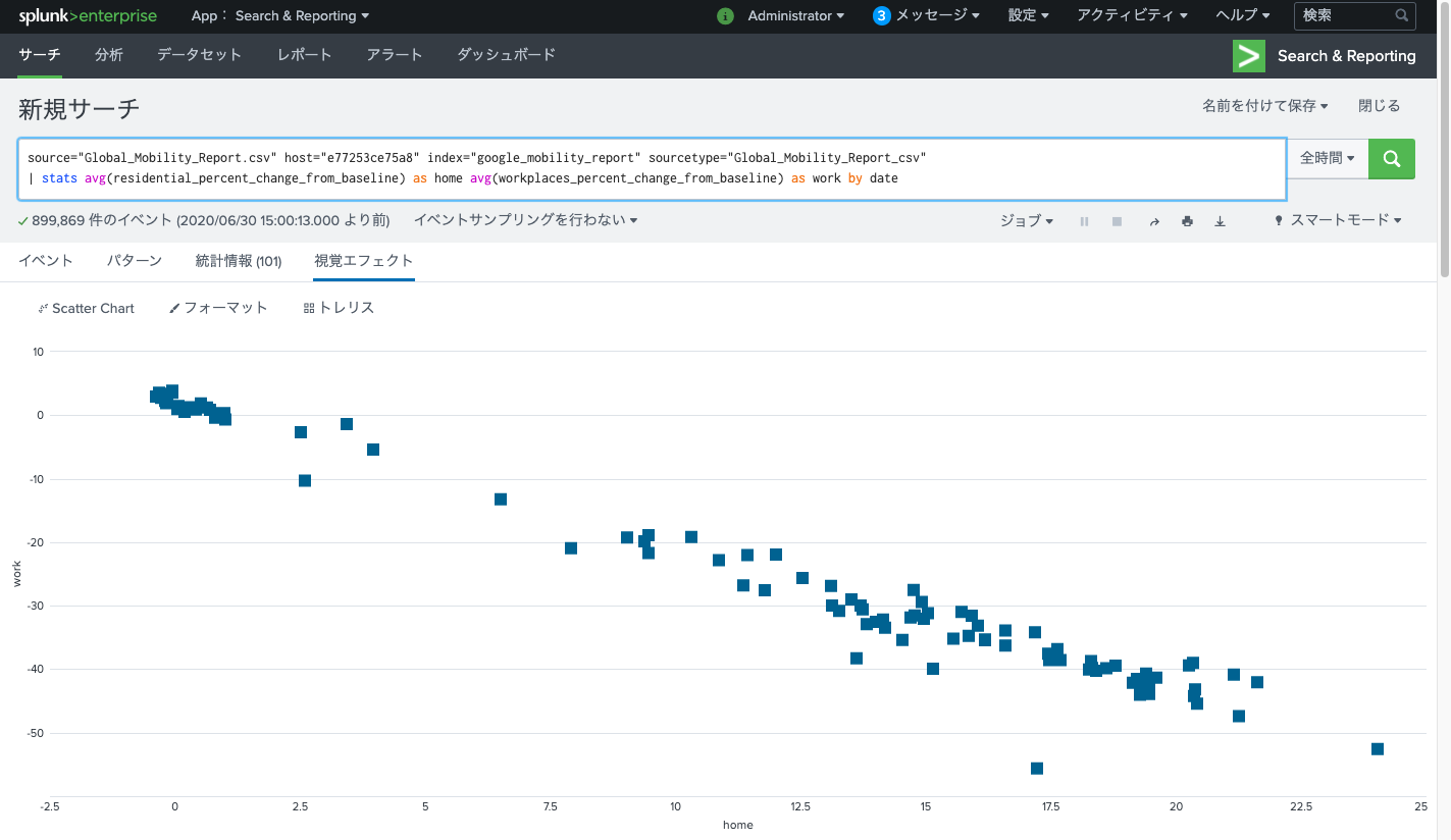
散布図(Scatter Chart)
index="google_mobility_report"
| stats avg(residential_percent_change_from_baseline) as home avg(workplaces_percent_change_from_baseline) as work by date
| stats <X軸の値> <Y軸の値> by <分類方法>
X軸・Y軸は↑の順で指定します。
下図の場合、出社している人の数とステイホームしている人の数がいい感じに比例しているのが分かりますね。
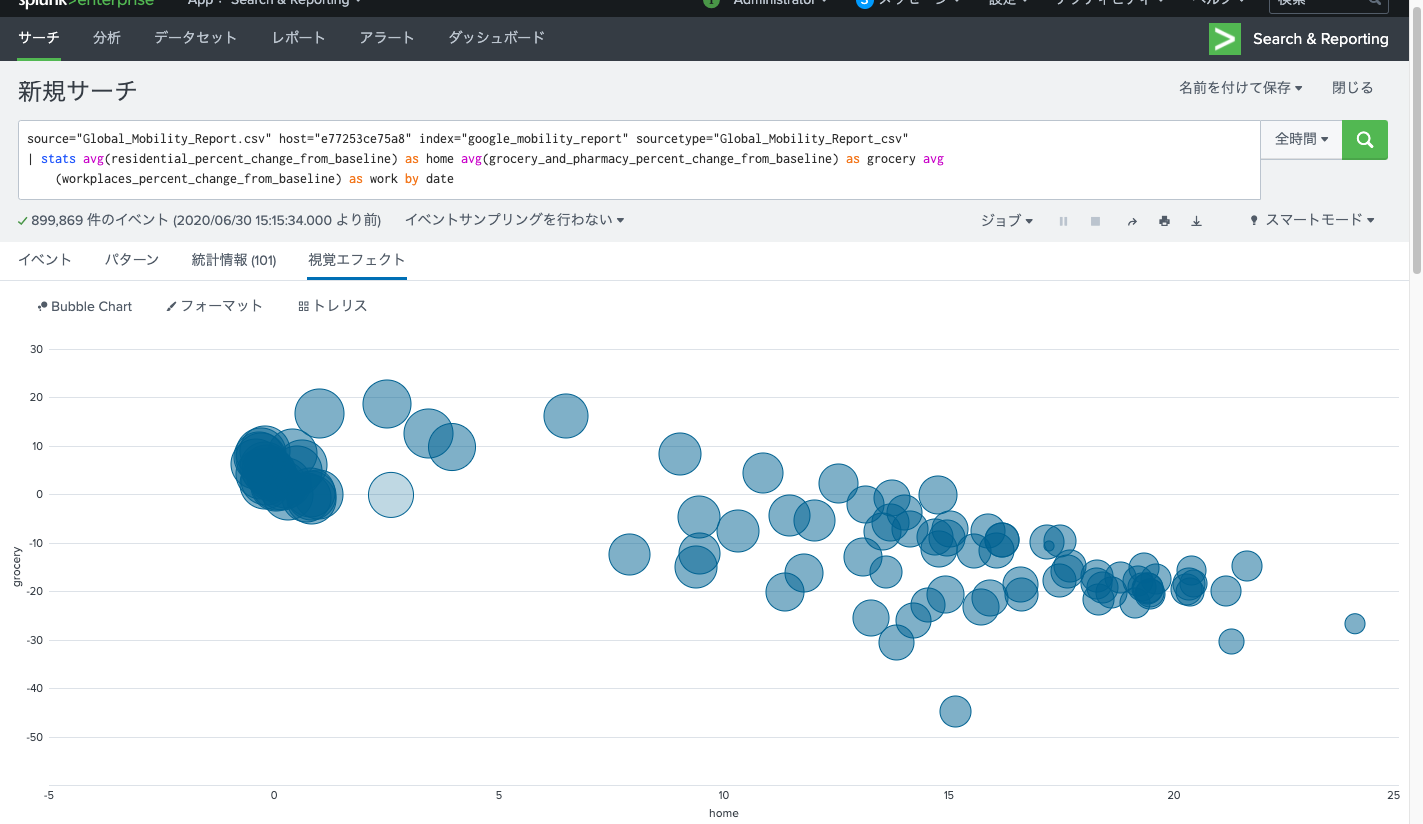
バブルチャート(Bubble Chart)
index="google_mobility_report"
| stats avg(residential_percent_change_from_baseline) as home avg(grocery_and_pharmacy_percent_change_from_baseline) as grocery avg(workplaces_percent_change_from_baseline) as work by date
| stats <X軸の値> <Y軸の値> <バブルサイズの値> by <分類方法>
X軸・Y軸・バブルサイズは↑の順で指定します。
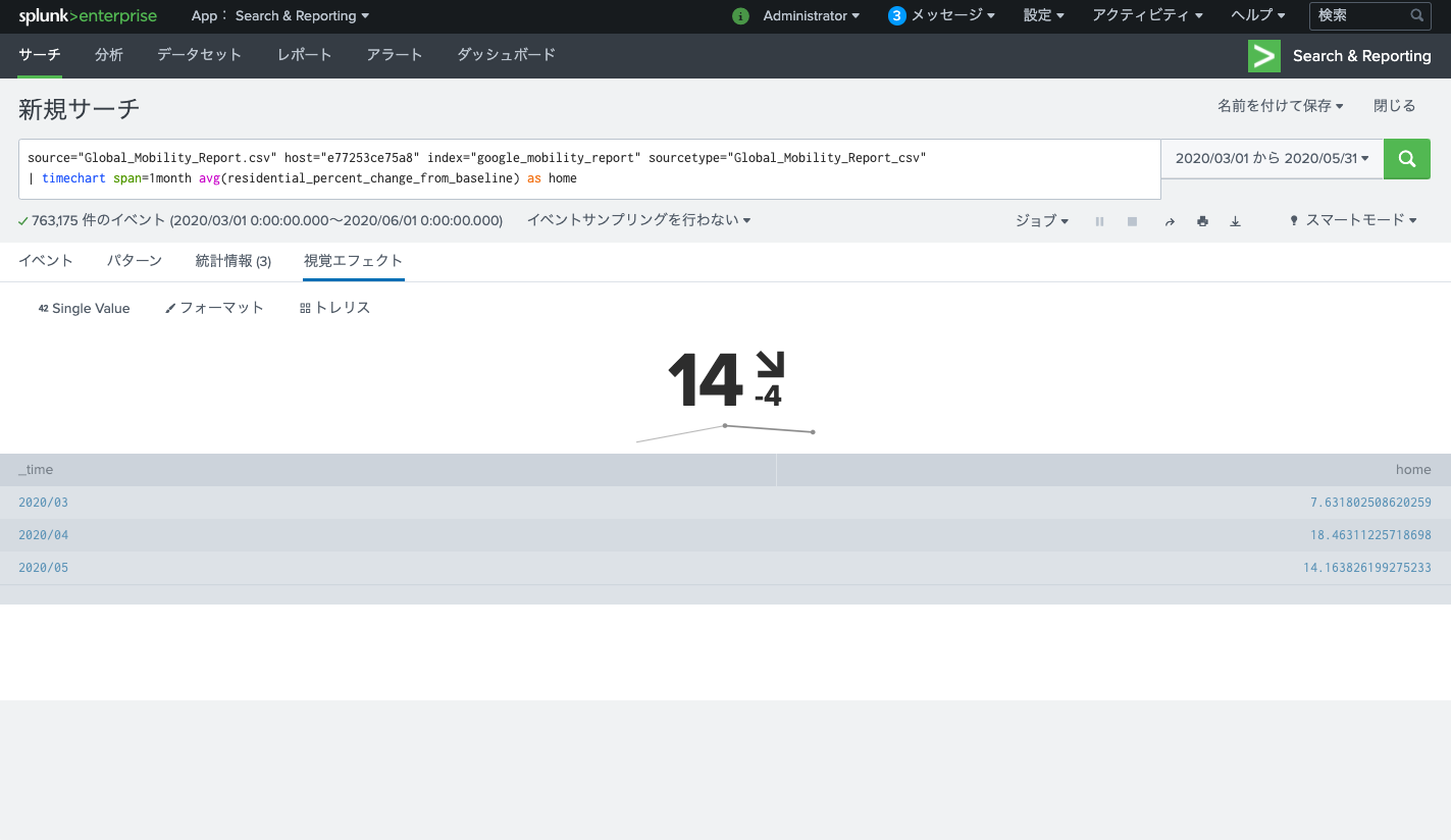
シングルバリュー(Single Value)
index="google_mobility_report"
| timechart span=1month avg(residential_percent_change_from_baseline) as home
| timechart span=XX <表示したい値>で指定します。
現在の値と前回からの変動が表示されます。
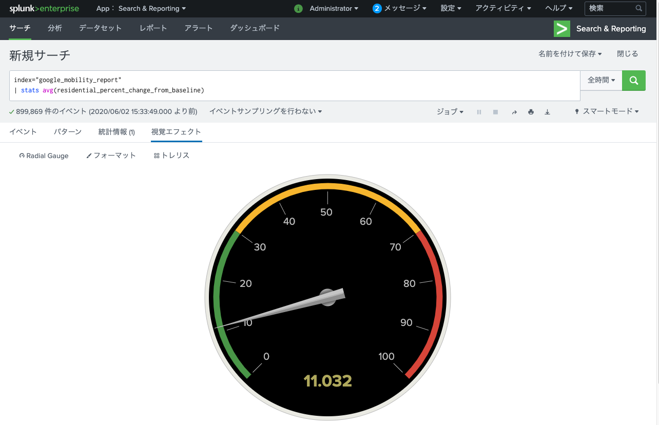
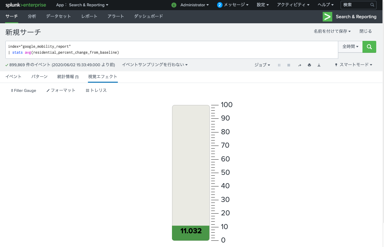
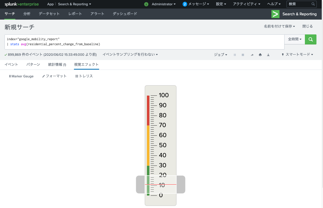
なんか見た目がカッコイイグラフ(Radial Gauge/Filler Gauge/Marker Gauge)
データに合わせてゲージが動くのでダッシュボードとかについてたらカッコイイと思います(厨二並感)
index="google_mobility_report"
| stats avg(residential_percent_change_from_baseline)
以下のグラフは全て↑のコマンドで、視覚エフェクトを変更しているだけです。| stats <表示したい値>で指定した一つの値のみを表示できます。
Radial Gauge
Filler Gauge
Marker Gauge
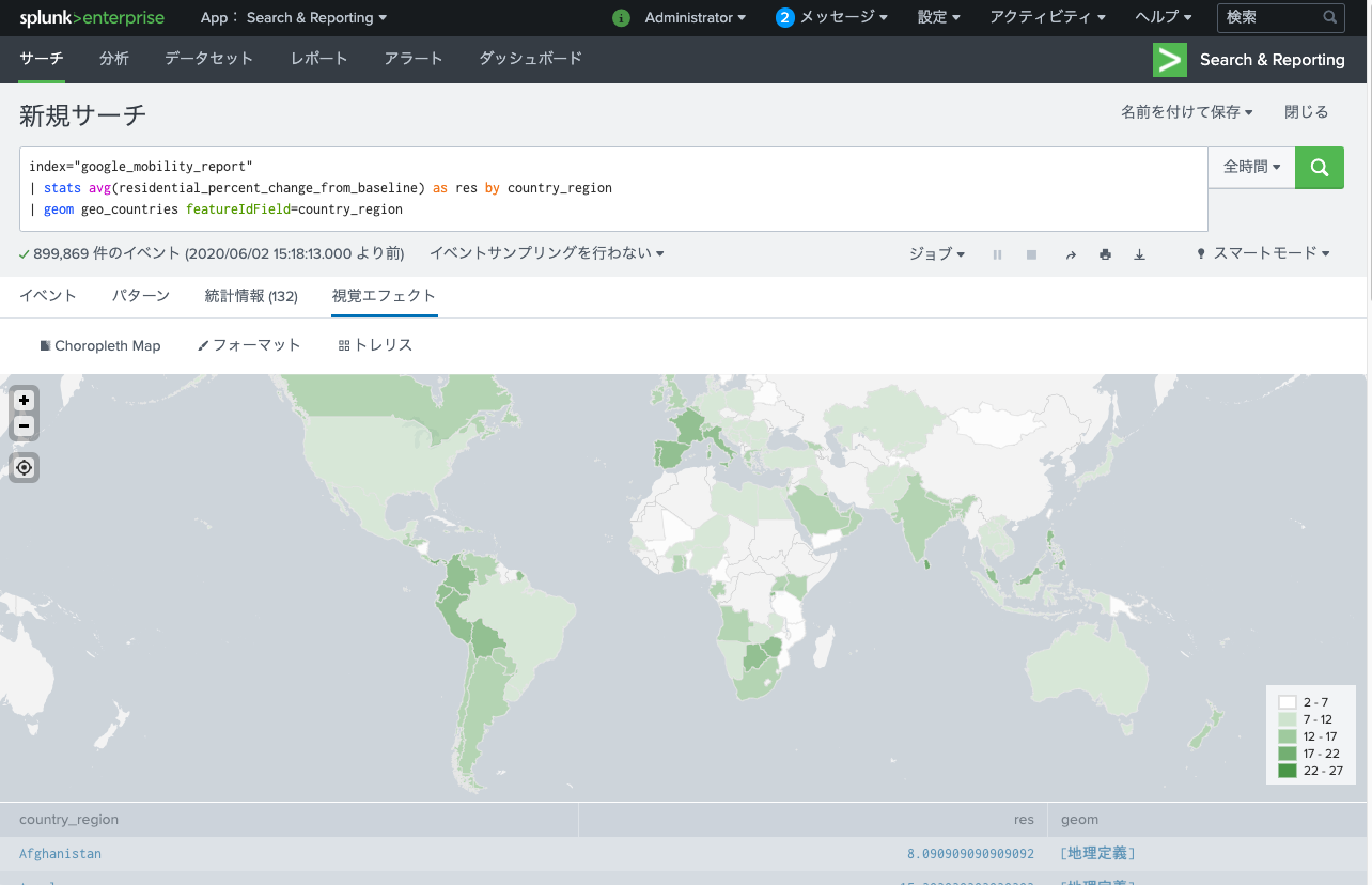
地図グラフ(Choropleth Map)
index="google_mobility_report"
| stats avg(residential_percent_change_from_baseline) as res by country_region
| geom geo_countries featureIdField=country_region
| geom <使用する地図情報> featureIdField=<地図情報に紐づく値> で指定します。
地図情報にはデフォルトで“geo_countries”(世界地図)と“geo_us_states”(USA地図)を使用することができます。
紐づく値には“geo_countries”の場合は国名のフィールド、“geo_us_states”の場合は州名のフィールドを指定します。
2020/7/8追記)
コメントで教えていただいたCluster Mapを追加しました。
to4kawaさんありがとうございます。
地図グラフ②(Cluster Map)
index="google_mobility_report"
| stats avg(*baseline) as *baseline by country_region_code
| lookup countries country as country_region_code OUTPUTNEW
| geostats latfield=latitude longfield=longitude globallimit=0 locallimit=0 count(*baseline)
| geostats latfield=<緯度のフィールド> longfield=<経度のフィールド> <表示したい集計値> で指定します。
※globallimit=0 locallimit=0は表示数の上限を解除するためのオプションなので必須ではないです。
※図をカラフルにしたかっただけなので例によって結果は意味のない値です。
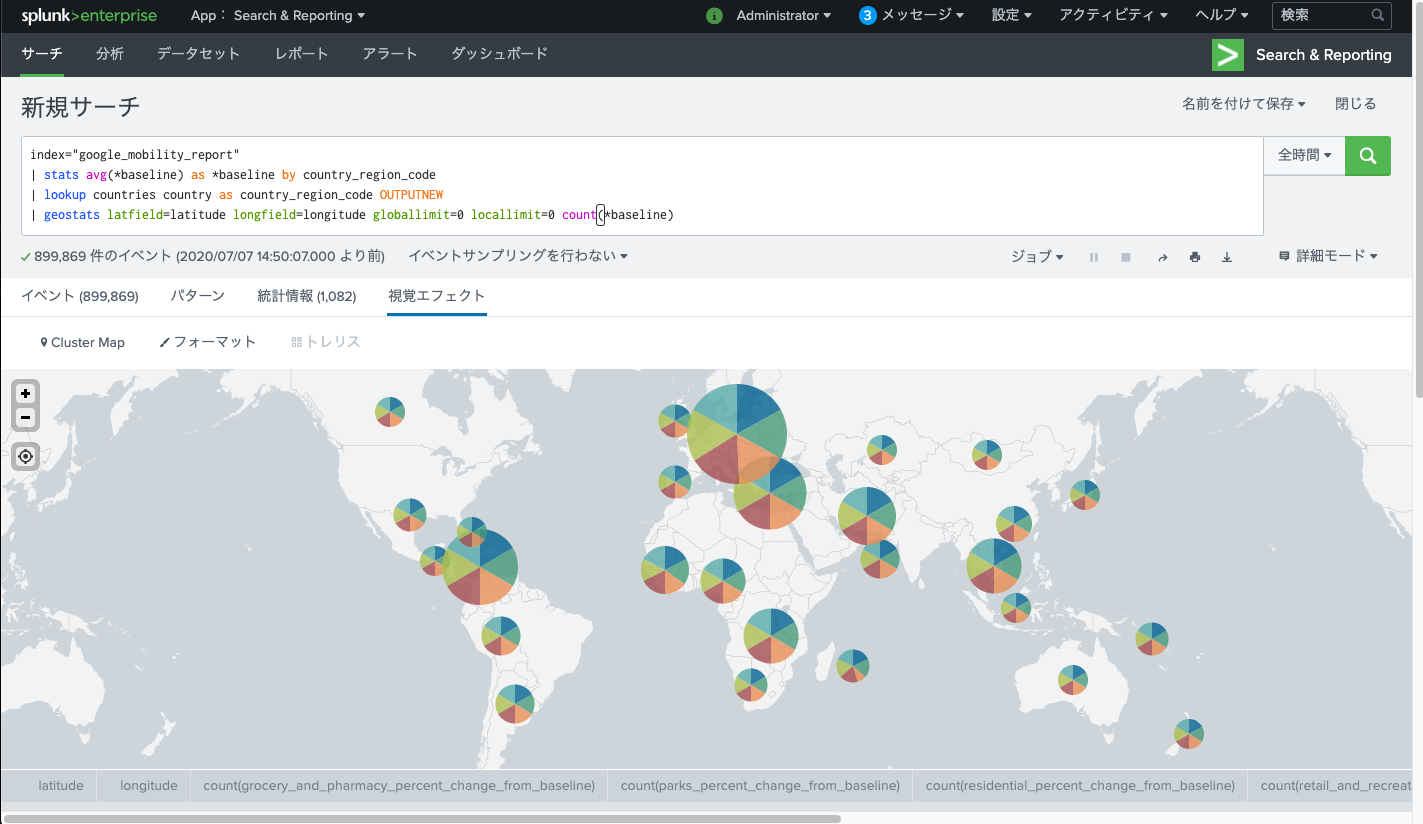
ルックアップに指定している“countries”は以下のデータを使用しています。
https://github.com/google/dspl/blob/master/samples/google/canonical/countries.csv
基本編は以上です。
分かりづらい箇所や間違っている箇所があればコメントください。

コメント
面白いデータをありがとうございます。
自分で取り込んでみたところ、props.confでTIME_PREFIXの設定が必要だったのですが
mathkuroさんの設定はどうされましたか?
自分はGUIからデータの取り込みを行ったのでprops.confは設定していないです…
お役に立てず申し訳ありません…
因みにGUIでソースタイプを設定した際はタイムスタンプ・フィールドに”date”を、タイムスタンプ形式に”%Y-%m-%d”を設定しました。
ありがとうございます。その設定で自分のSplunkが動かないのが不思議です・・・
https://developers.google.com/public-data/docs/canonical/countries_csv
こんなデータがありましたので、lookupを作るとCluster Mapでもつかえると思います。
source=”global_mobility_report.csv” date=”2020-06-*”
| stats avg(*baseline) as *baseline by date country_region_code
| sort transit_stations_percent_change_from_baseline
| dedup country_region_code
| head 10
| lookup country country as country_region_code OUTPUTNEW
| eval transit=-1 * transit_stations_percent_change_from_baseline
| geostats latfield=latitude longfield=longitude avg(transit) by name
良いデータありがとうございます!!
早速使わせていただきました◎